Painting Stories-2 (The Split Complementary color scheme)-Blog 11
- Websidezone .

- Jan 28, 2019
- 4 min read
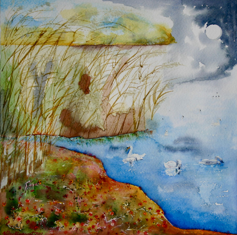
In this blog I describe the color scheme of another favorite painting of mine shown below. It is titled Meditation-26. It is made on Fabriano cold pressed 300 gsm paper in 36″x 26″ size. Leaning towards Indian contemporary and somewhat abstract art, the Meditation series floral paintings are happy and serene. These paintings portray agitation of mind at one end (before) and tranquility at another (after). Elements of trees and flower plants such as buds, flowers, leaves, twigs, fruits, trunks, create this transition in interesting and abstract manner. The rhythm is from bottom to top or sideways, or diagonal. In this large size painting meditation is depicted thru a Rose plant. The painting is based on theory of Split Complementary colours and approved by the Master Colorist Stephen Quiller. This painting can be hung together with Meditation-27.

How do artists choose color schemes? Or……how they should? Many artists have the natural talent to select harmonious colors to convey the mood they want but others require systematic study and practice to acquire that skill. These are the topics that internationally known color master Stephen Quiller– working primarily in water media – discusses in his famous book “Color Choices-making color sense out of color theory“. His research and development of a color wheel for painters – called the “Quiller Wheel” – is now used by thousands of painters throughout the world.
In his book Stephen Quiller structures the color schemes as follows:
1. Monochromatic
2. Complementary
3. Analogous
4. Split Complementary
5. Triadic
I read the book to learn his color theory. I also made some paintings using his color theory. I was happy with the outcome of some paintings. In this blog I shall describe one of those paintings titled Meditation-26, shown above. In this painting I used the Split Complementary color scheme. To reconfirm whether I had used the scheme correctly, I sent the image of the finished painting to Stephen Quiller for his comments. I was pleasantly surprised to receive his confirmation “Vijay, It certainly looks like a split complementary. The way I use it is yellow-green (to the yellow side) green (viridian), and a touch of blue-green although you could just use the first two if necessary. and the split is the viridian with its complement quinacridone rose. Good luck and best, Steve”
The basic color wheel shown below has 12 major colors on the circle. These are pure colors, not muted by their opposites. The 3 primary colors are yellow, blue, and red. These 3 are the purest and the brightest colors and can not be obtained by any mixing. The 3 secondary colors are obtained by mixing two primaries in equal proportion. These are green, violet, and orange. And the 6 tertiary colors are obtained by equal mixing of one primary and one secondary. These are yellow green, blue green, blue violet, red violet, red orange, and yellow orange.

A Split Complementary color scheme uses 3 analogous colors and a 4th color that is the complementary of the mid-analogous color. In the above color wheel of 12 major colors, any 3 adjacent colors are termed analogous colors. Complementary color that is used is the one that is right opposite the middle analogous color. Which 3 analogous colors to use is the decision that the artist has to take depending upon what mood is to be depicted.
For example one may use red violet, violet, and blue violet as the 3 analogous colors. The 4th color would be the complementary of violet (mid analogous) i.e. yellow. These 4 would make a Split Complementary color scheme. Stephen Quiller advises using muted colors rather than the pure colors. Thus each analogous color would be muted (or semi neutralized) with its own complementary or just the complementary of the mid analogous color, which is Yellow in this case. Further, the colors may be darkened by adding black (derived black rather than solid black in the case of watercolors) or lightened either by thinning or adding white. Such semi neutralized usage of colors rather than the pure colors would make a very pleasing composition. Use of complementary would bring accent to the painting, unlike in the case of Analogous color Scheme where no complementary is used. Actually, Split Complementary scheme is a pleasing variation of Analogous color scheme.
In my painting Meditation-26, I used green (viridian) as the mid analogous color. The adjacent colors used are yellow green and blue green. These were obtained by mixing yellow to green and blue to green respectively. The image below shows the areas of the painting where the 3 analogous colors ( 2 of them muted) have been used. Complementary of the mid green (viridian) is the permanent rose color that was used to provide the accent to the painting. Without it the painting would have fallen in the category of Analogous color scheme. Split Complementary scheme is a pleasing discord of the Analogous Color scheme. I used the complementary permanent rose in pure state and in small area, just sufficient to provide the accent rather than taking attention away from the green theme.

In the picture below of Meditation-26, are shown the areas where the semi neutrals of the 3 greens have been used. I used only the permanent rose to semi neutralize the greens. The other option was to use respective complementaries of the 3 greens. I also used darkened permanent rose in middle part of the painting to provide some focus by imparting contrast.

The white filaments of the withered flowers were obtained by leaving the paper white by masking. I applied Daler Rowney’s masking fluid with thin low cost brush and after it had dried I painted the area with darkened permanent rose and other colors. Once the paint completely dried, the masking was removed by rubbing with eraser, and the whites of the paper emerged.

Stephen Quiller of Colorado, United States is most known for his use of color, color theory, and his approach to water media painting. He has written 6 books and produced numerous DVD’s pertaining to these subjects, and has a number of top-quality art materials that he endorses. Artists worldwide use Stephen’s products and books, and his work is now collected internationally. He is winner of more than a dozen awards. He teaches and conducts several workshops.
Your comments:
I will be happy to receive you comments and respond.


Comments